It is somewhat hard to make an impression about a new operating system without using it full-time, but I'll try.
First of all, I have to say that the system became snappier. At the very least, it feels like after I started the computer I was able to get to the Windows Explorer with the list of my files. I don't know what's happened: smarter startup sequence, less services launched during OS booting or something else, but it does the trick. With Windows 7 I many times decided not to even power on the machine to do something recalling how long it would take to get to the point, when I can start actually doing my thing.
Over the past week I've been using the laptop with all new and shiny Windows 10 as a secondary machine for some background tasks. This does not give me much data to discourse on the qualities of the OS, but there is one thing one cannot miss, when using Windows. And that is the Start menu.

While many people are happy it is back, it looks to me I'm not going to use it much. The main reason: I do not see how it is going to help me with what I would previously do via the Start menu.
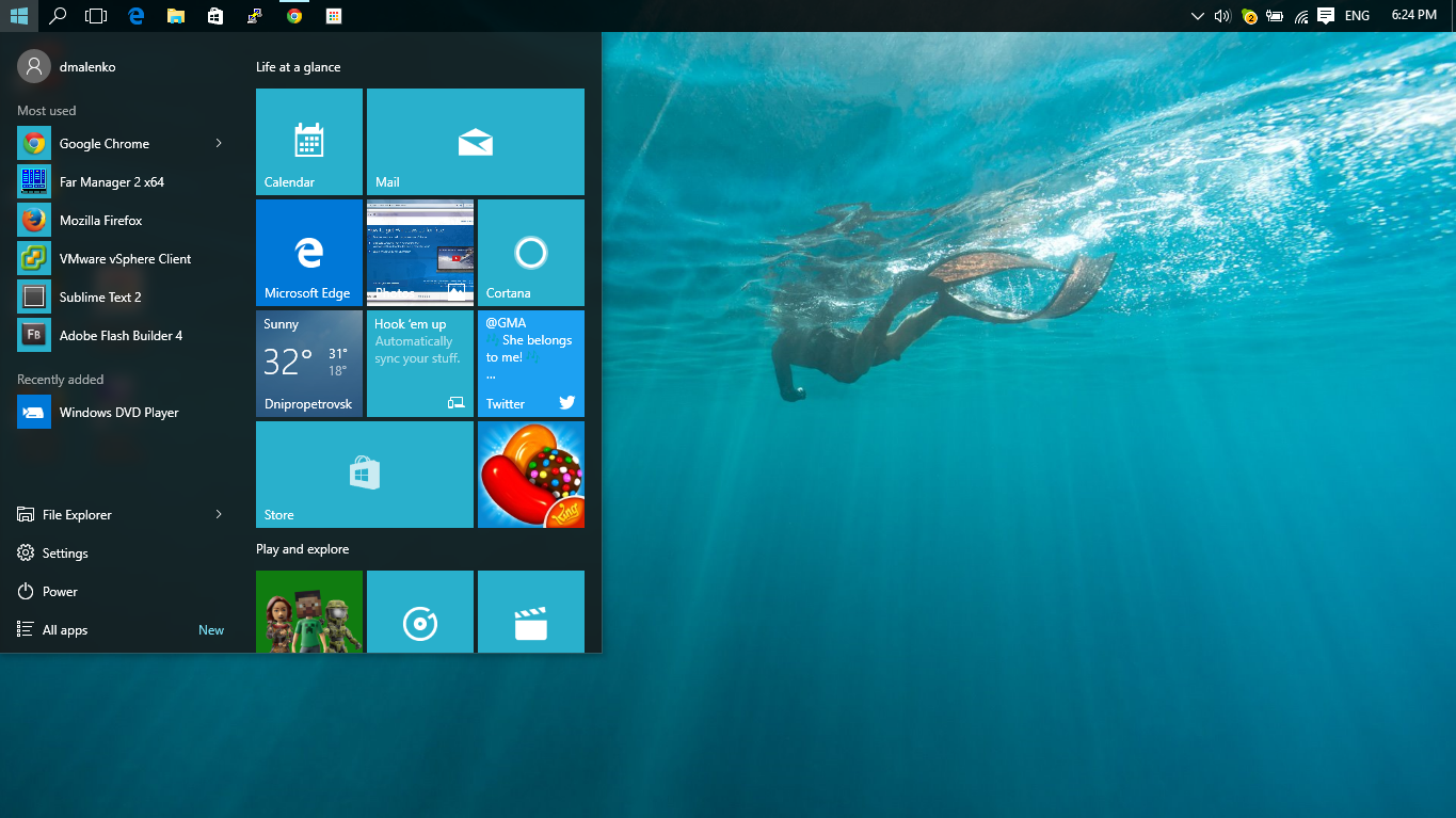
New and shiny tiles. While I understand why Microsoft put them all there – to promote their built-in apps, it makes little sense to users like me, who have their apps and workflow already setup. Why would I want to see their new Mail instead of the Outlook, which is already fully configured?
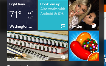
Bright, all blue tiles. The problem is they all indeed are blue (at least those on the first screen), they all look the same and to figure out what is where I have to pay too much attention. It can be possible to get used to it, but it hardly will be completely comfortable ever after long use.

Shiny, flashing tiles. Twitter, feature promotion, Store, Candy Crush – all of that grabs your attention, when you open the Start menu. But how often to you click Start to check what Kim Kardashian is up for, see what's trending on the App Store or say "To hell with work! Let's play Candy Crush!" The Start menu aimed at (I supposed) helping you do your stuff now goes far enough to distract you from that.
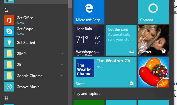
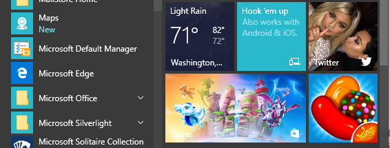
Apps list (Start > All apps) comparing to Windows 7 also changed for the worse. All app icons appear on the same blue tiles making them almost indistinguishable. These tiles are fairly large making fewer apps appearing in the list at the same time. But the worst thing, I think, is that the list of apps is sorted alphabetically. I've seen that on fullscreen tiled apps list in Windows 8 and did not like it there already. How are you supposed to find Skype under G as "Get Skype"?

When you are looking for a system browser on freshly installed Windows 10, are you supposed to check B for Browser, I for the Internet (analogous to Mail, Photos, etc.), E for Edge or M for Microsoft Edge?

Alphabetic sorting works great for your contacts, because contacts are regular – everyone has first name and last name. App names are anything but regular and alphabet sorting make very little sense there. This hardly helps the Start menu serve its purpose.
After all, Start > Settings seems to be only useful and useable option in the entire Start menu.

